
Change the chat widget color, logo and launcher
Match the Opskeet chat widget to your brand: set the color, logo, theme, corners, launcher icon, position and footer in Settings.
The chat widget takes your brand color and logo, and you can change how the launcher button looks and where it sits. A live preview beside the settings shows every change before you save.
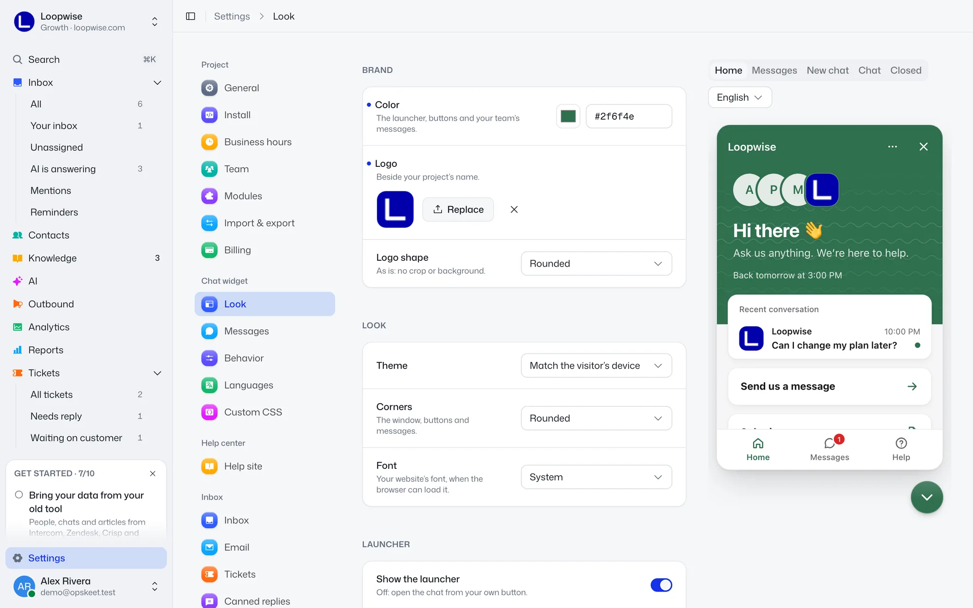
Go to Settings → Chat widget → Look. Owners and admins can edit. Agents see the settings read-only.
Brand
| Setting | What it does |
|---|---|
| Color | Default #1531e9. Used for the launcher, buttons and your team's messages. Enter a 6-digit hex like #1531e9. |
| Logo | Shown beside your project's name. Upload a PNG, JPEG or WebP up to 1 MB, or click From your website to take your site's icon. |
| Logo shape | Rounded (default), Circle or As is (no crop or background). Only shown when a logo is set. |
The logo and color also style your help site.
Look
| Setting | Options |
|---|---|
| Theme | Light, Dark or Match the visitor's device (default). |
| Corners | Square, Slightly rounded, Rounded (default), Very rounded. Applies to the window, buttons and messages. |
| Font | System (default) or Your website's font, when the browser can load it. |
Launcher
The launcher is the round button that opens the chat.
| Setting | Notes |
|---|---|
| Show the launcher | On by default. Turn it off to open the chat from your own button. See Control the chat with JavaScript. |
| Icon | Chat bubble, Chat with dots, Smile, Question mark, Wave, Headset, Sparkle chat, Pebble, or Your own. |
| Style | Soft, Flat or Outline. Hidden for your own icon. |
| Your own | An image (PNG, JPEG or WebP, up to 1 MB), a GIF or a short video (MP4 or WebM), up to 3 MB. |
| Icon color | Empty means automatic: white or black, whichever reads better. Hidden for your own icon. |
| Size | 48 px by default, from 40 to 96. |
| Corners | Square, Slightly rounded, Rounded or Fully rounded (default). |
| Position | Bottom right (default) or Bottom left. |
| Distance from the edge | 20 px by default, from 0 to 120. Under More options. |
| Label | Text beside the icon, up to 30 characters, like "Chat with us". Empty shows only the icon. |
The Label sets the main language only. With several languages on, use a link next to it to set the other languages in Messages.
Footer
Footer sets the line under the chat: Powered by Opskeet, Your own or Off (default). For your own, add Footer text (up to 60 characters) and an optional Footer link starting with http or https. It opens in a new tab. On the Agency plan, Powered by shows your agency's name and links to its website, see Put the app under your own brand and domain.
Click Save when you're done. A reset arrow appears next to any setting that differs from its default.
Related
Did this help?
Related articles
- Identify signed-in users with a secure tokenShow who's chatting in the Opskeet inbox by passing a signed token from your server, so chats follow users across devices.
- Control the chat with JavaScriptOpen, close and hide the Opskeet chat from your own buttons and code, open help articles, switch language and listen to chat events.
- Track events from your siteSend custom events from your site to Opskeet to see what visitors did before they wrote, build goals and trigger outbound messages.
- Chat widget settings: email ask, files, typing and onlineChoose what visitors see and share in the Opskeet chat: asking for email, file uploads, typing, online dot, seen marks and reply time.
- Style the chat widget with custom CSSAdd your own CSS to change the look of the Opskeet chat widget, with the classes you can style and the limits. Only the chat is affected.